I'm a writer first, a photographer second. My writing is based on observation. I photograph people, places, and things as I see them. With a passion for food, interior design, art, music, travel and fashion, I'll be bringing these 'live' to this site.
Thursday, September 23, 2010
Model Reflections
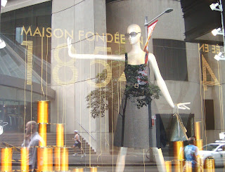
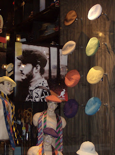
These shots were taken at the Parade of Models Festival, Double Bay, Sydney. The reflections caught my eye but the charming elderly gentleman was blissfully oblivious of them and just went about his business,
Wednesday, September 15, 2010
Sunday, September 12, 2010
Sunday, September 5, 2010
Interior decorating on a shoe string (for renters) http://ani4design.blogspot.com
If you're a renter you're stuck with the design features you inherit but....like figure faults,
with clever decorating you can enhance the good and disguise the bad.
The country kitchen picks up on the casual theme.
with clever decorating you can enhance the good and disguise the bad.
- Decide on a decorating 'theme' and stick to it throughout the interior
- Look at the 'bone' structure. If the ceilings are low keep the furnishings to scale.If they're lofty and the rooms are large you can branch out with comfy over stuffed couches and a few 'statement' pieces.
- Keep the wall colours neutral and monochromatic throughout to give the idea of space. If there's no outlook consider a feature wall to add personality.
The country kitchen picks up on the casual theme.
Now for decorating ideas that cost little to produce yet deliver big results
Check out this exciting yet inexpensive way to bring colour into your world. I spotted these 'happy' cushions in the back bar of a pub at Bondi Junction
Labels:
colourful cushions,
Interior decorating,
renters
City Lines
Good design is the sum of its parts - line, shape, form and function.
Commercial architecture, the most visual and longstanding design form combines
all these elements. If you take time to look up when you're in the city you'll notice
a mix of styles and designs all competing for 'air' space. Sometimes they work together, but most often they don't, and the good architecture is hidden amongst
the bad.
Take a look at these shots taken in Broadway, Sydney. They're a representative
sample of just how complex the streetscape and its skyline can be.
Labels:
Broadway,
City Architecture,
Line and design,
Sydney
Wednesday, September 1, 2010
About the City
Friday 03 September
Martin Place is the pivotal centre of the Sydney CBD runs down from Macquarie Street to George Street.
Banks and Finance companies are moving out and as the economy picks up 'ritzy' luxury fashion houses are moving in.
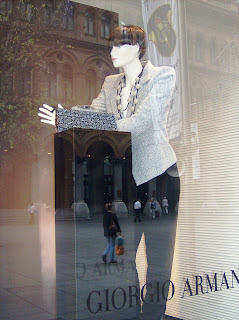
Here's a selection of what's in the windows in and around Martin Place.
In a less Ritzy part of town, close to the cinema district is a little Patisserie that serves the most divine small cakes. Once you've enjoyed window shopping in the 'big' end of town I suggest you check it out.
Azuma Patisserie - Regent Plaza Shopping Arcade, 501 George Street.
Subscribe to:
Comments (Atom)


